Today we have some KonNetwork patch notes to go over. I’ve finished several UX and UI improvements to make the site easier to read and use.
Maintaining an independent site means constantly tweaking the small things that usually go unnoticed until they break. These updates focus on cleaning up the visual clutter and making the backend more efficient so the content remains the priority.
UI & Design Updates
Consistent Coloring
Buttons are now uniform with the sidebar main color and link hover colors. Meta labels also match those button colors now.
Previously, the site had a few conflicting shades of blue and gray that made certain sections feel disconnected. This new unified palette helps the navigation feel more cohesive as you move between different reviews and guides. It creates a much more professional look that lets the art and text breathe.
Typography & Quotes
The lede font styling is better now and won’t flashbang you with bold font. It looks a lot cleaner.
I realized the previous weight was too heavy for long form reading, especially for those of us who spend hours looking at screens. The quotes are more refined and easier to read. I wanted them to stand out without being distracting, so the new styling uses subtle borders to frame the text better. This helps when I’m pulling technical data or specific developer quotes that need to be distinct from the main analysis.
Technical Fixes
Lightbox Correction
I found and fixed a lightbox glitch that was hitting every image on the website. Lightboxing will now only work when I manually set the image to have that function.
I was being a bit aggressive with the code while trying to find a better plugin and it targeted every single image in an article rather than just the ones I wanted. This was especially annoying for small decorative icons or tiny screenshots that didn’t need to be blown up. Now, only the high resolution art and detailed gameplay shots will trigger the zoom.
Performance Gains
I optimized the entire image library. There are performance gains without trade offs. I spent a good amount of time running everything through a compression workflow to make sure the site stays snappy.
Search, categories, and other archival pages have been retooled for a better experience and better image quality. The goal was to reduce the page weight so that the site loads quickly even if you have a slower connection. This is part of a larger effort to keep the site fast for mobile users without sacrificing the visual fidelity of the game screenshots.
Site Navigation & Features
Front Page Organization
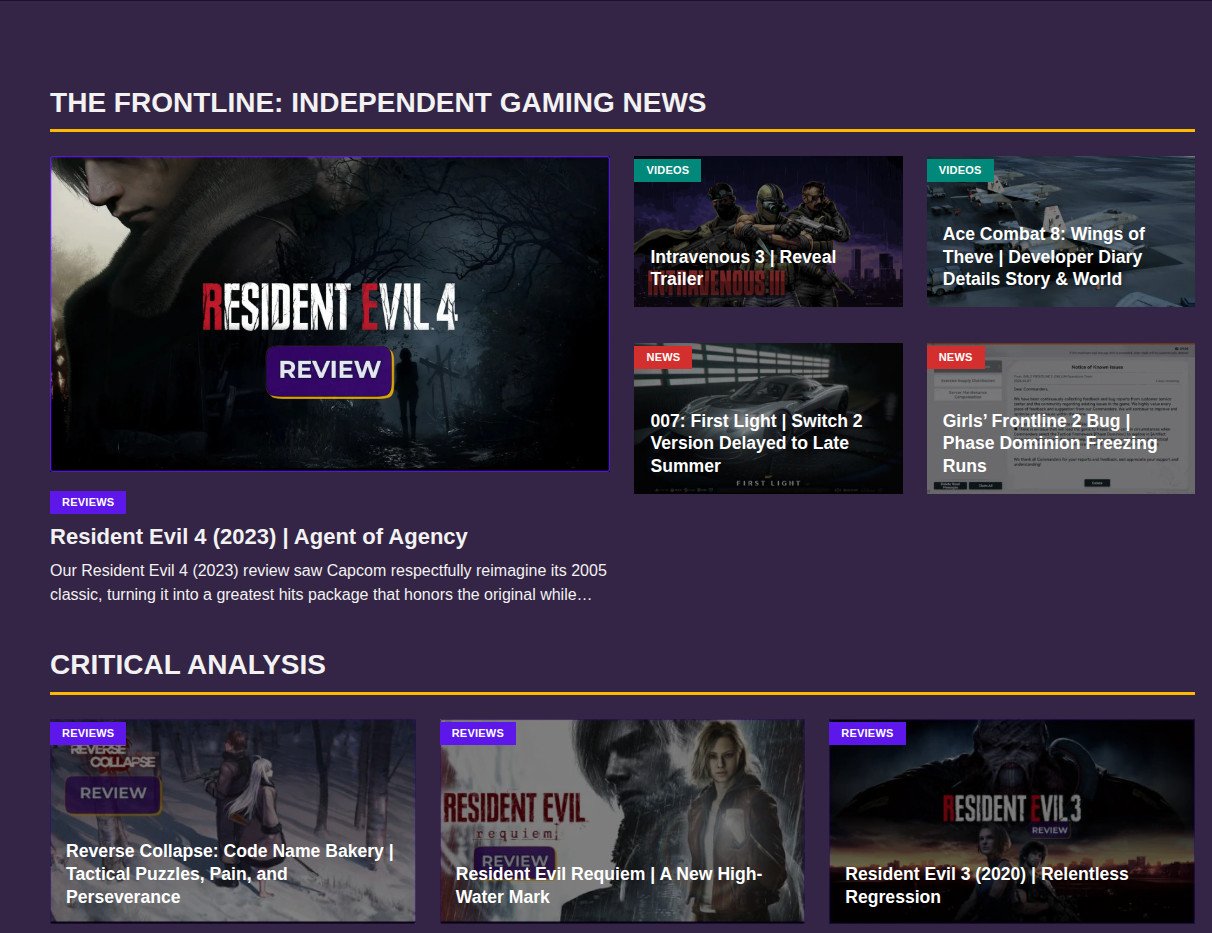
Many pages have undergone tweaks. The front page is now organized by content types.
This makes it easier to distinguish between a deep dive analysis, a quick news update, or a featured guide. If you are looking for specific tactical RPG coverage, you won’t have to scroll through unrelated posts to find it. The categories should feel more logical and easier to navigate from the jump.
Related Posts & Comments
The related posts section has better code now to serve more meaningful articles. I wanted the suggestions to actually be relevant to what you just finished reading.
I also overhauled the comment system to make it easier for humans and harder for bots. The spam was getting a bit out of hand, so the new verification should keep the discussion focused on the games. It’s important that the community space stays usable for real players.
New Content
Resident Evil 4 (2023)
Our review of Resident Evil 4 (2023) released today. This was a massive project that required a lot of testing, specifically looking at how the remake holds up on modern hardware and Linux setups.
I’ve been documenting my progress on the overhauled Editorial Review Pipeline page. The pipeline page is where I track everything I’m currently playing or analyzing. It gives you a look at what is coming next, whether it’s a retro shooter or a new visual novel. This transparency helps me stay organized and gives you an idea of when to expect the next big update.
Girls’ Frontline 2
I am currently in the process of revising older Girls’ Frontline 2 character guides to bring them up to the structural standards of the most recent ones.
Team recommendations, common keys, expansion keys, and other relevant information will be added to these if not already present. I want these guides to be a reliable resource, so standardizing the data across all characters is a priority for the next few weeks.
Socials & Review Formatting
Social Media Shift
We’re live on Tumblr and much more active on there than X. It is a lot quieter but there are far fewer algorithms and AI suppressing your posts.
It feels like a better fit for the kind of long-form analysis and niche gaming discussions we do here. If you want to keep up with smaller updates or quick thoughts, that’s the place to be.
Newsletter
I have also launched a newsletter with Kit if you don’t want to miss the latest site updates. Social media is a gamble these days, so this is the best way to bypass the algorithms.
I’ll be sending out a weekly roundup of our latest reviews and guides so you can get the best of the site delivered straight to your inbox. I won’t be spamming you; it’s just a direct way to make sure you actually see the work.
Review Formatting Feedback
As we move forward with more reviews, it makes more sense to incorporate more visual supplemental content like gameplay clips. This helps explain and help the understanding of how the mechanics or concepts work as needed.
Recently, we did this with Resident Evil 4 (2023), but we started it with Metroid Prime 4: Beyond when demoing the mouse controls to have a fully comprehensive analysis of the game.
Is this something that you prefer over a static image with a caption and a passage of text? Let us know in the comments below, along with any other features or suggestions you have.
As always, if you’re new here, thanks for visiting. To those who continue to visit, I appreciate your support and I hope you learned something.